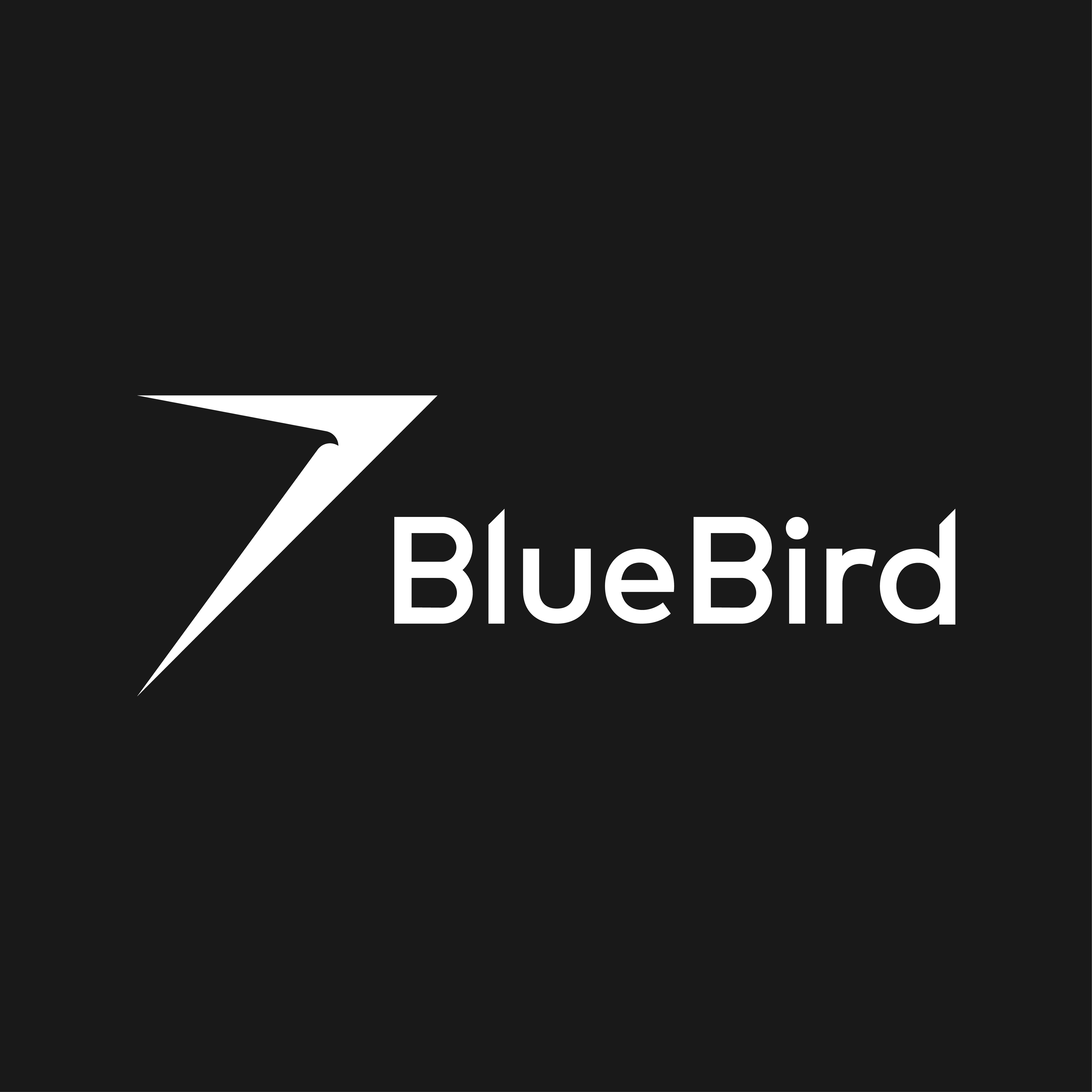
Short listed brand identity for the public transport company Bluebird. The client was looking for a bold new look that would be instantly recognizable. I was inspired by the forms found in automobiles from the 1950s and earlier, their romantic notions of speed and form. I wanted to create a bold iconic mark that reassembled a bird taking flight, something akin to a cross between a Delta, a bird and the Spirit of Ecstacy. The resemblance to the North East of Scotland's geography was a subtle but deliberate nod to the overall region the client operates in.


