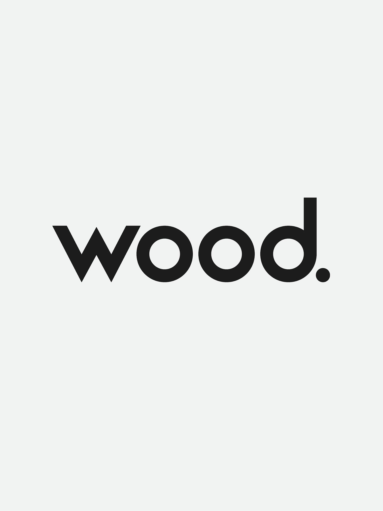
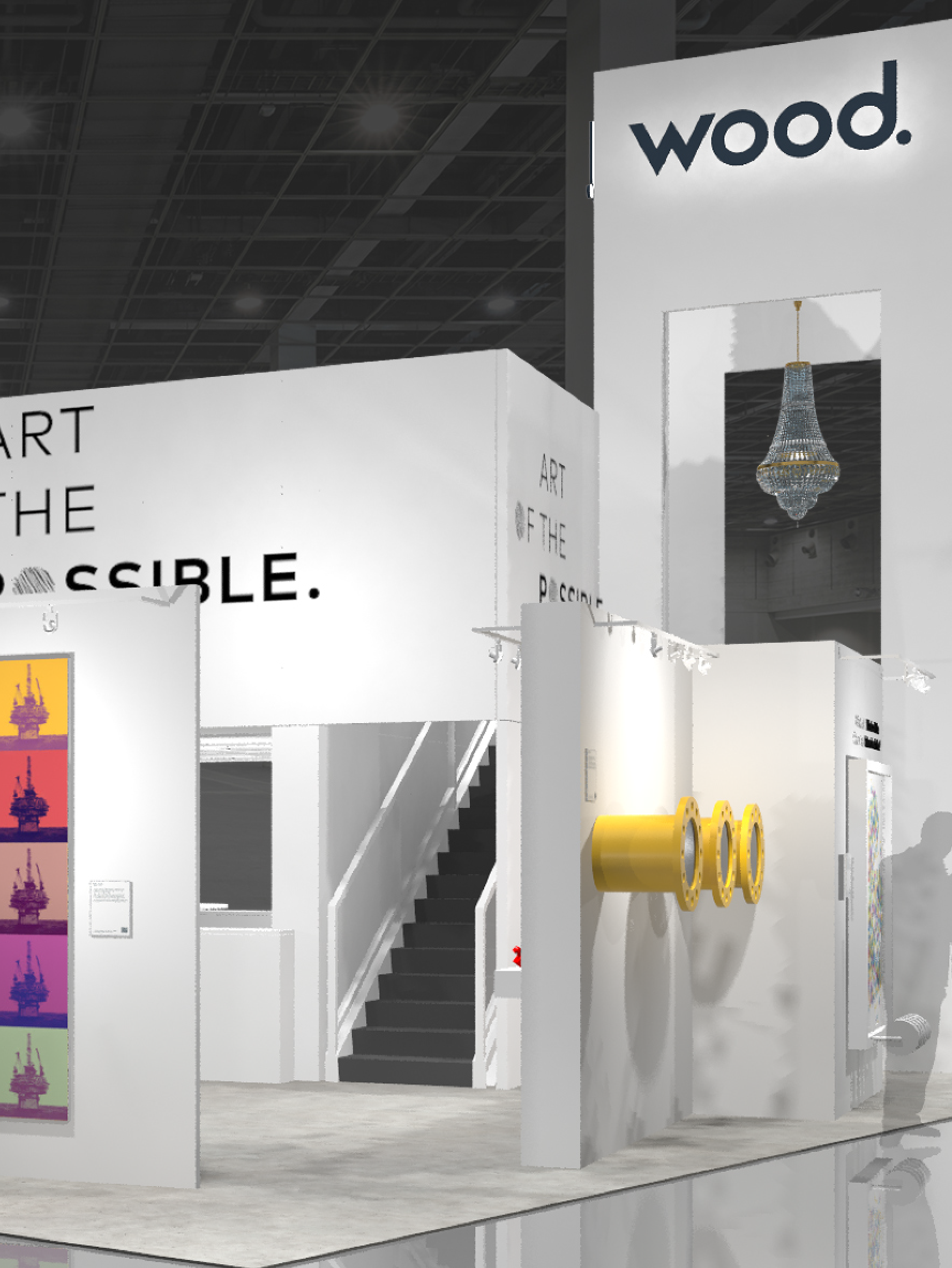
An initial brand refresh for Wood Group prior to the Amec Foster Wheeler acquisition.
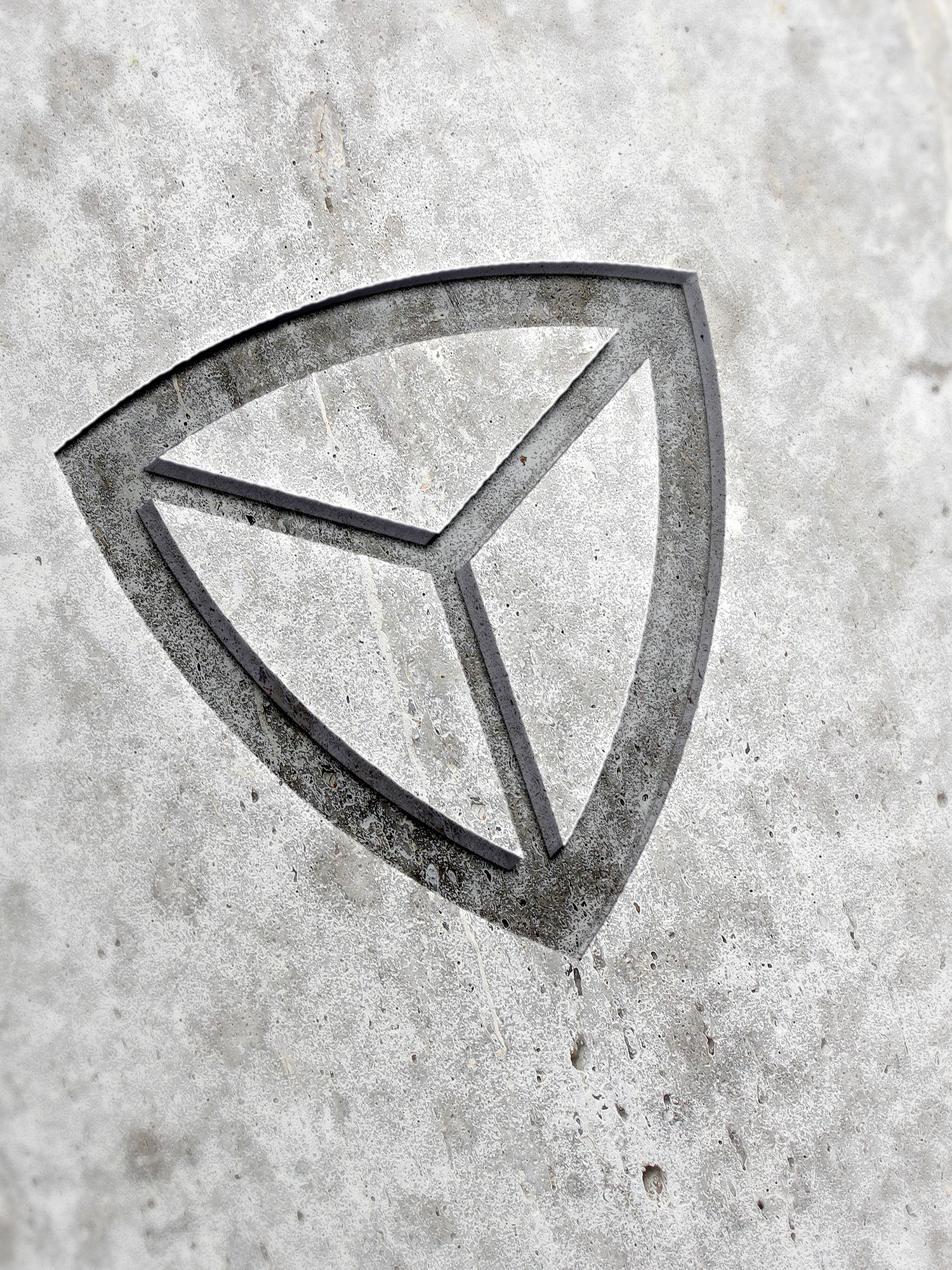
I wanted to go with something that felt robust and unpretentious which was something i felt the the original Wood Group brand had. I wanted the mark to have very precise and pure geometry. The blocky feel i felt underpinned the robust and reliable theme.
This project was an internal experiment on what we could do to elevate the iconic and aged Wood Group logo.


