Visual Identity for a global recruitment firm specializing in recruitment of energy sector contractors.
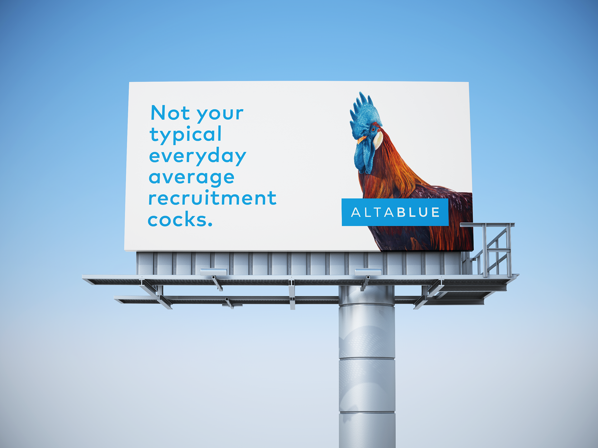
Clients opted for the name choice, they wanted something non descript and flexible to play with visually. I decided that we had to find a way to stand out and differentiated against the competition in an industry often associated with negative connotations. I liked the idea of a campaign that was tastefully self deprecating, that highlighted the less than appealing aspects of recruitment industry. I wanted to leverage this self awareness in favor of the clients brand, by using a kind of "anti-ad" approach.
Clients opted for the name choice, they wanted something non descript and flexible to play with visually. I decided that we had to find a way to stand out and differentiated against the competition in an industry often associated with negative connotations. I liked the idea of a campaign that was tastefully self deprecating, that highlighted the less than appealing aspects of recruitment industry. I wanted to leverage this self awareness in favor of the clients brand, by using a kind of "anti-ad" approach.


